Skar magazine
On the edge rebellious
BRIEF
Skate magazine has had a long journey from its original birth. Raw, uninhibited and experimental. How can a once daring and experimental Skate magazine lose its original edge with time, then come back to life, fast and strong and keep its present audience engaged? How can we showcase women on the skate scene, pushing hard for opportunities to show their skate boarding skills like their male counter parts.
SOLUTION
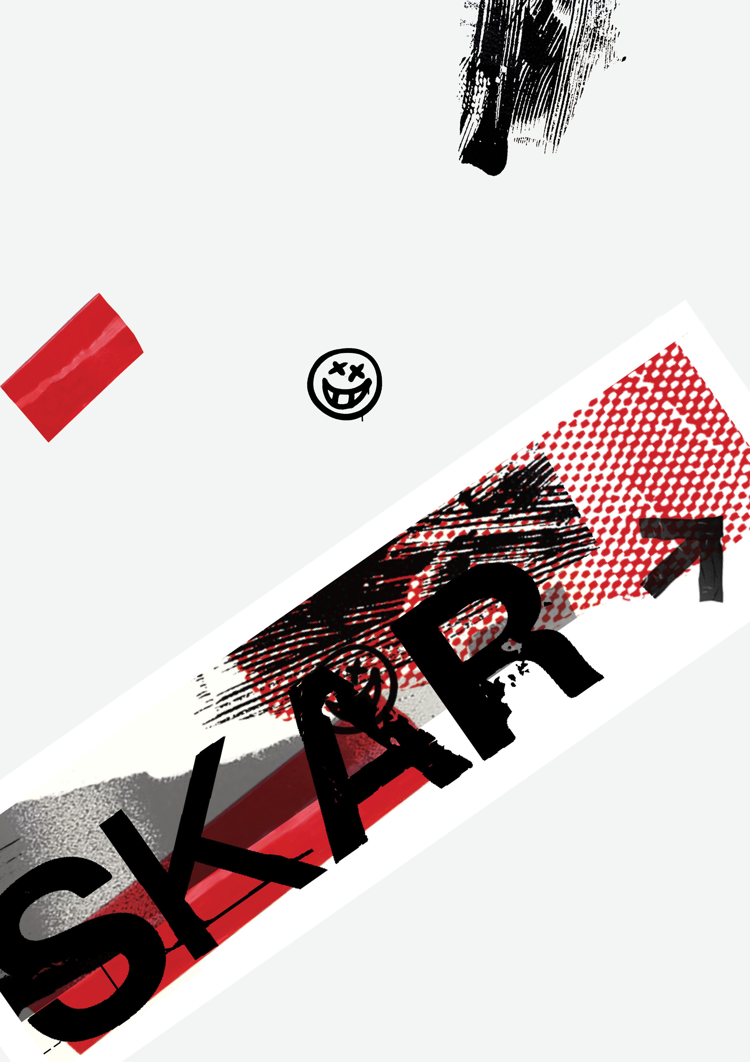
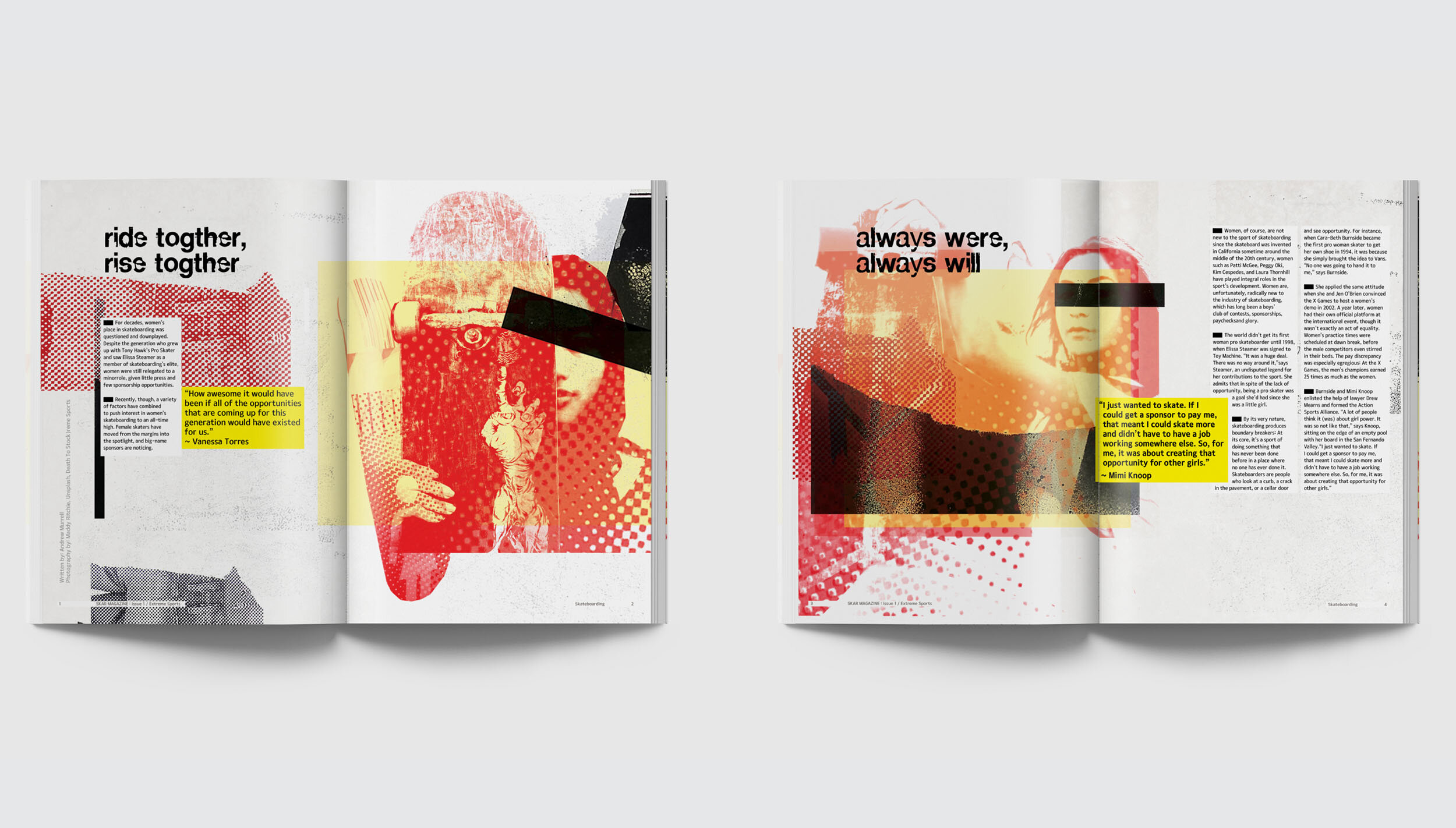
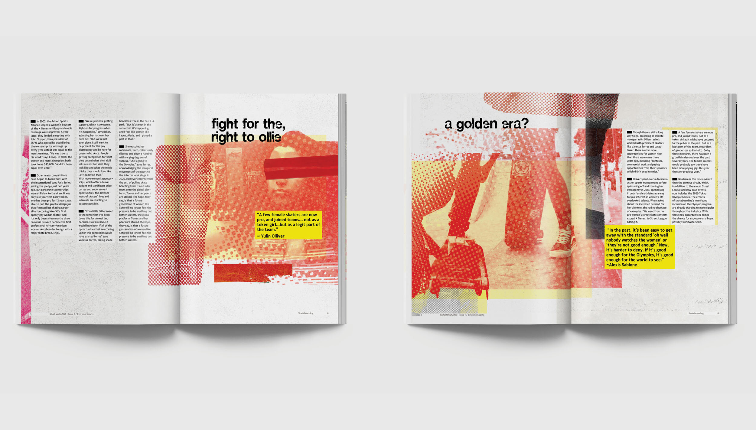
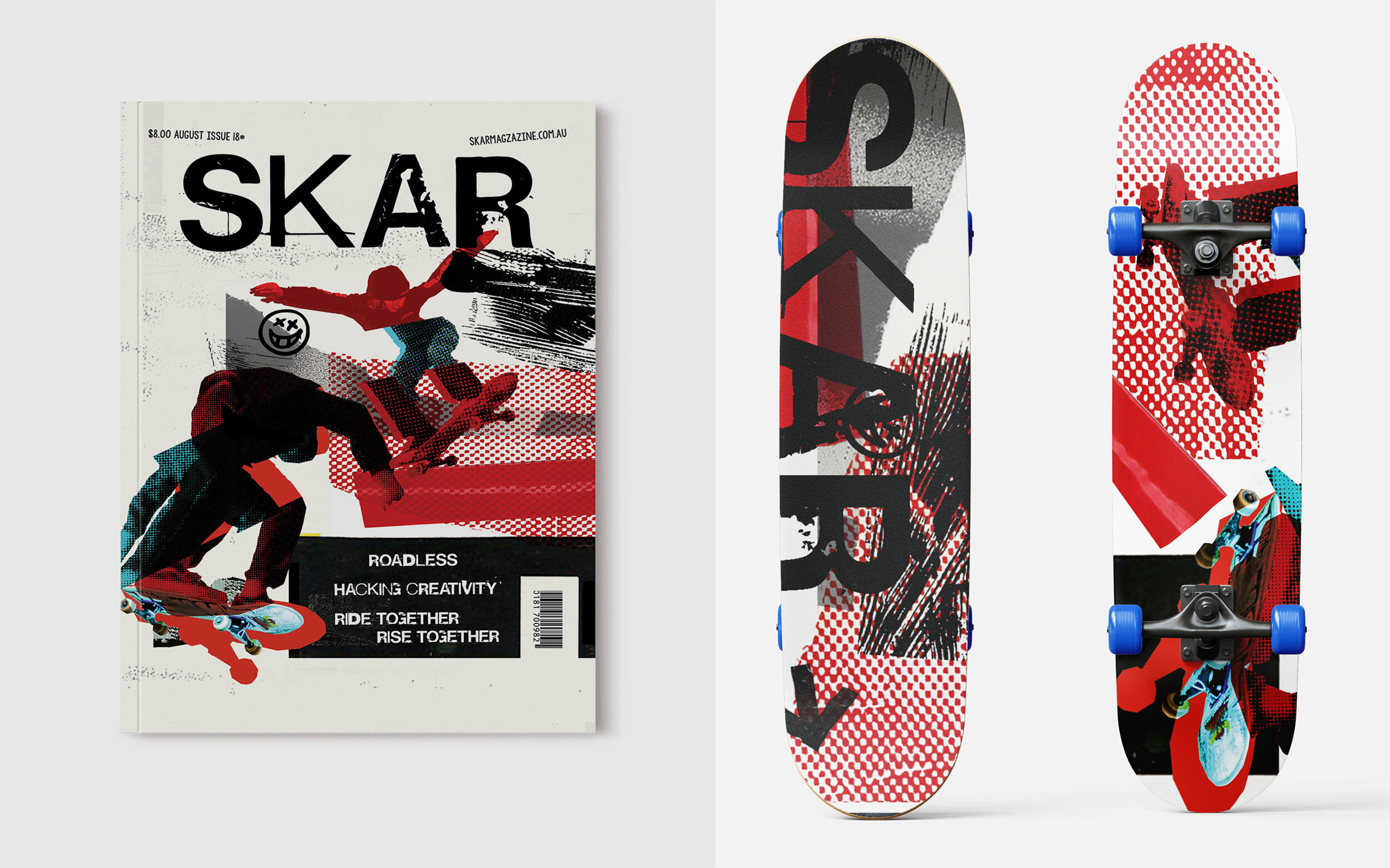
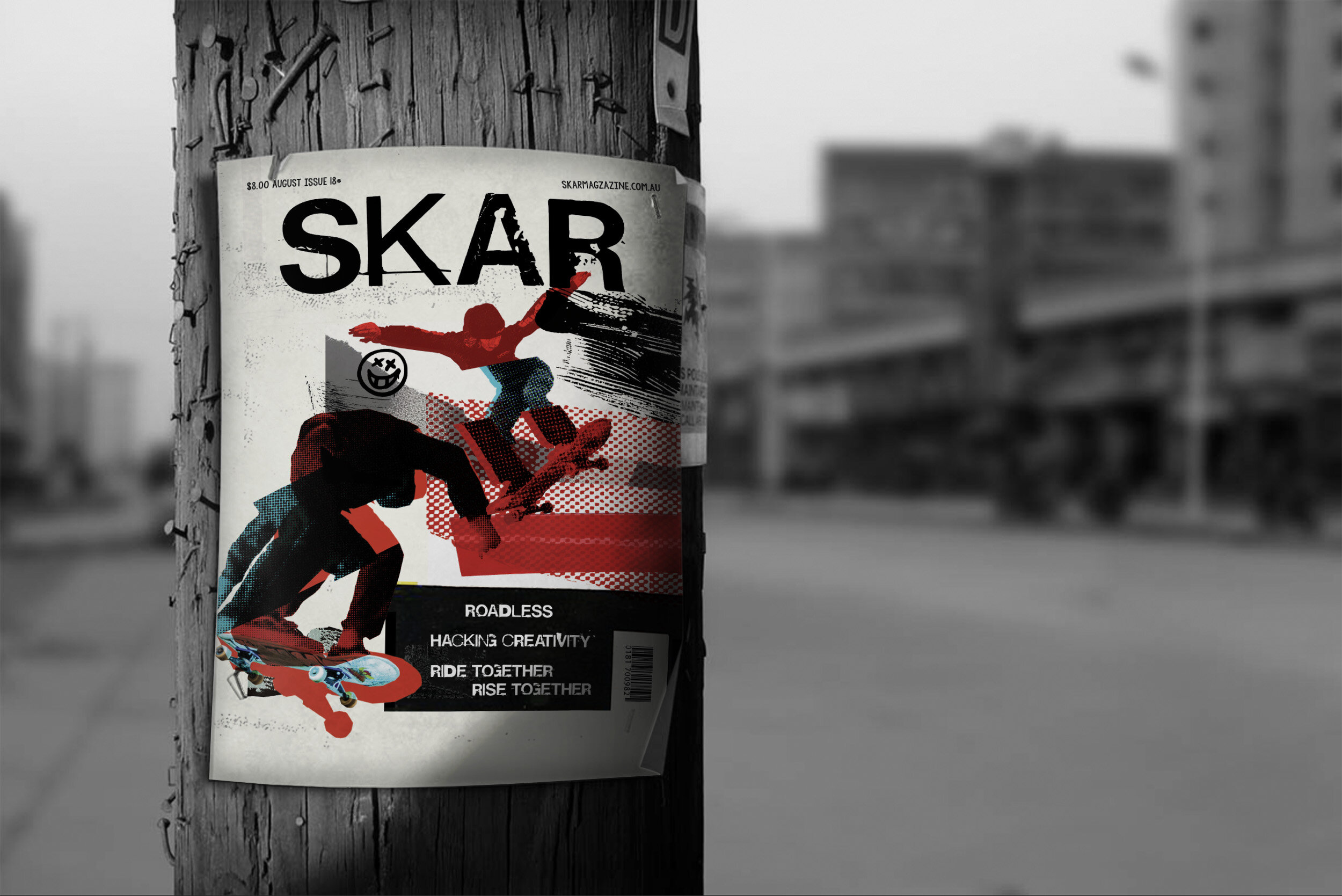
Bringing the Skar magazine into the future, the brand is evolved through a refined styling but keeping distortions, rebellious nature and the discomfort that comes with being daring as part of its visual style.
Graphical elements of sharp edges and grunge also help to tell their stories..
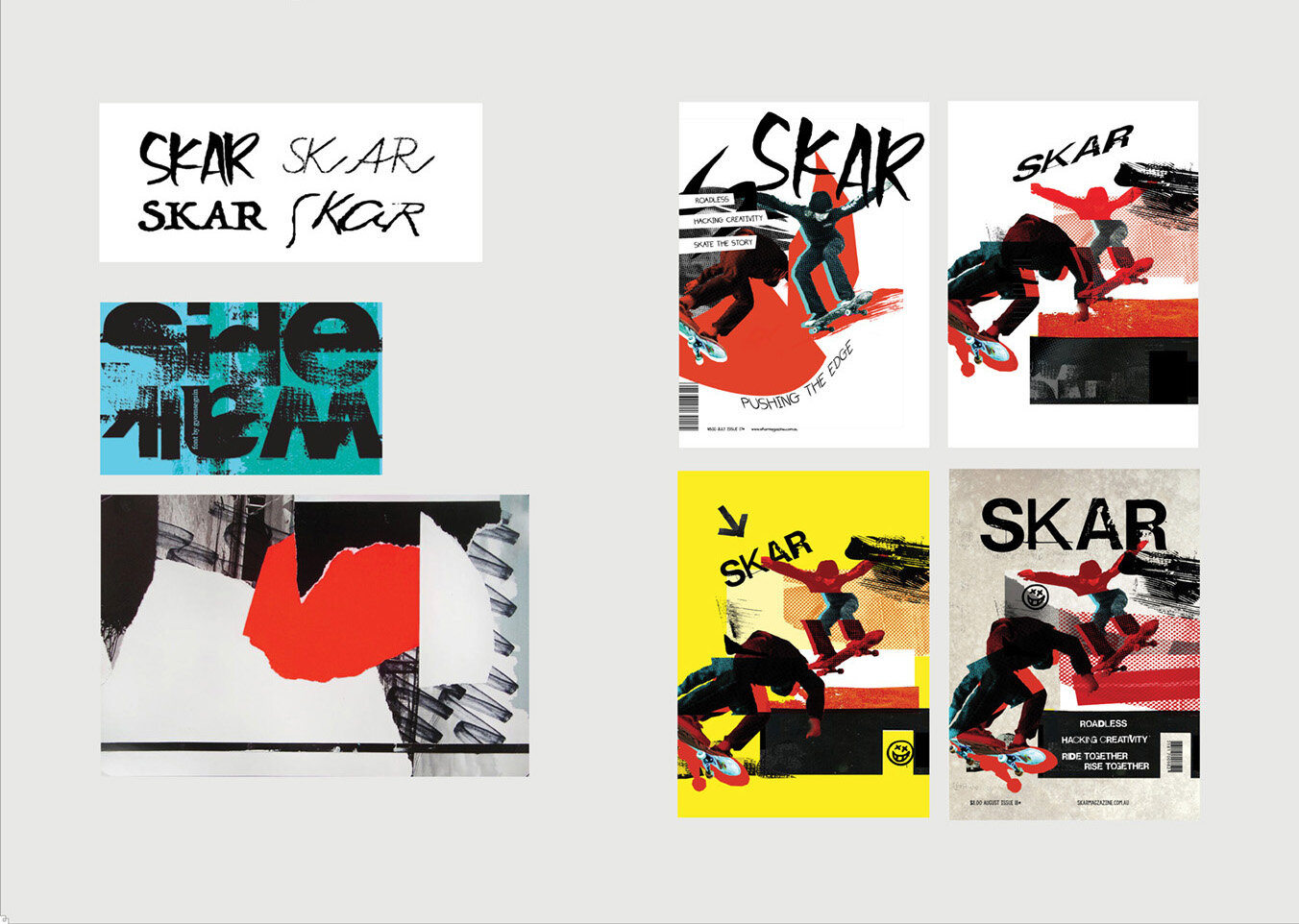
The evolution of SKAR magazine
REBELLIOUS / DYNAMIC / ATTITUDE
Using these main descriptive words and references as cues to visualise the design, enable the cover and the magazine layout to invoke the disruptive energy that it needed.
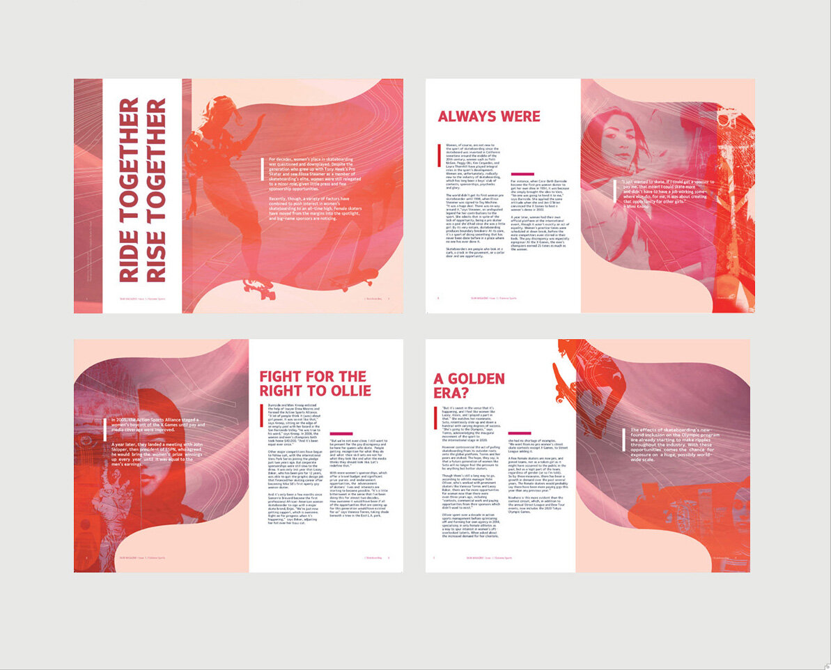
Initial approach to women’s skateboarding
Initial approach had different word cues that felt more organic and feminine.
After combining with the cover, it lacked the raw energy of the magazine’s personally and needed a revamp.
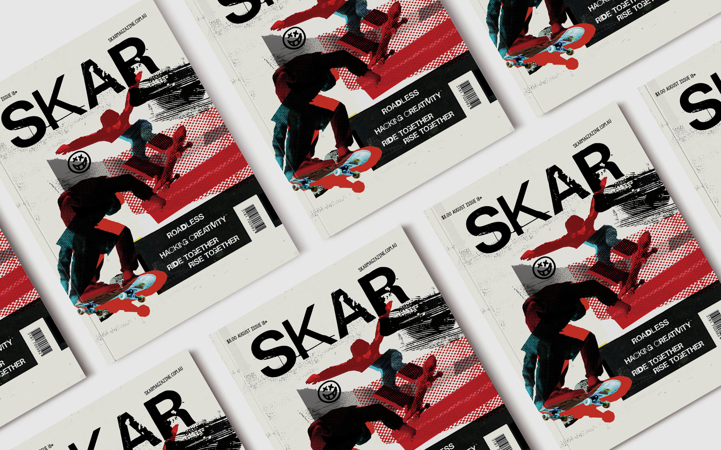
SKAR MAGAZINE
The revamp
The future of women in skateboarding
"In the past, it’s been easy to get away with the standard
'oh well nobody watches the women' or 'they’re not good enough.’
Now, it’s harder to deny. If it’s good enough for the Olympics,
it’s good enough for the world to see."
~Alexis Sablone.
Disclaimer. This project has been created to showcase creativity, planning, execution and the completion of a concept. Thank you to all image resources provided by professionals to realise my creative spark.
