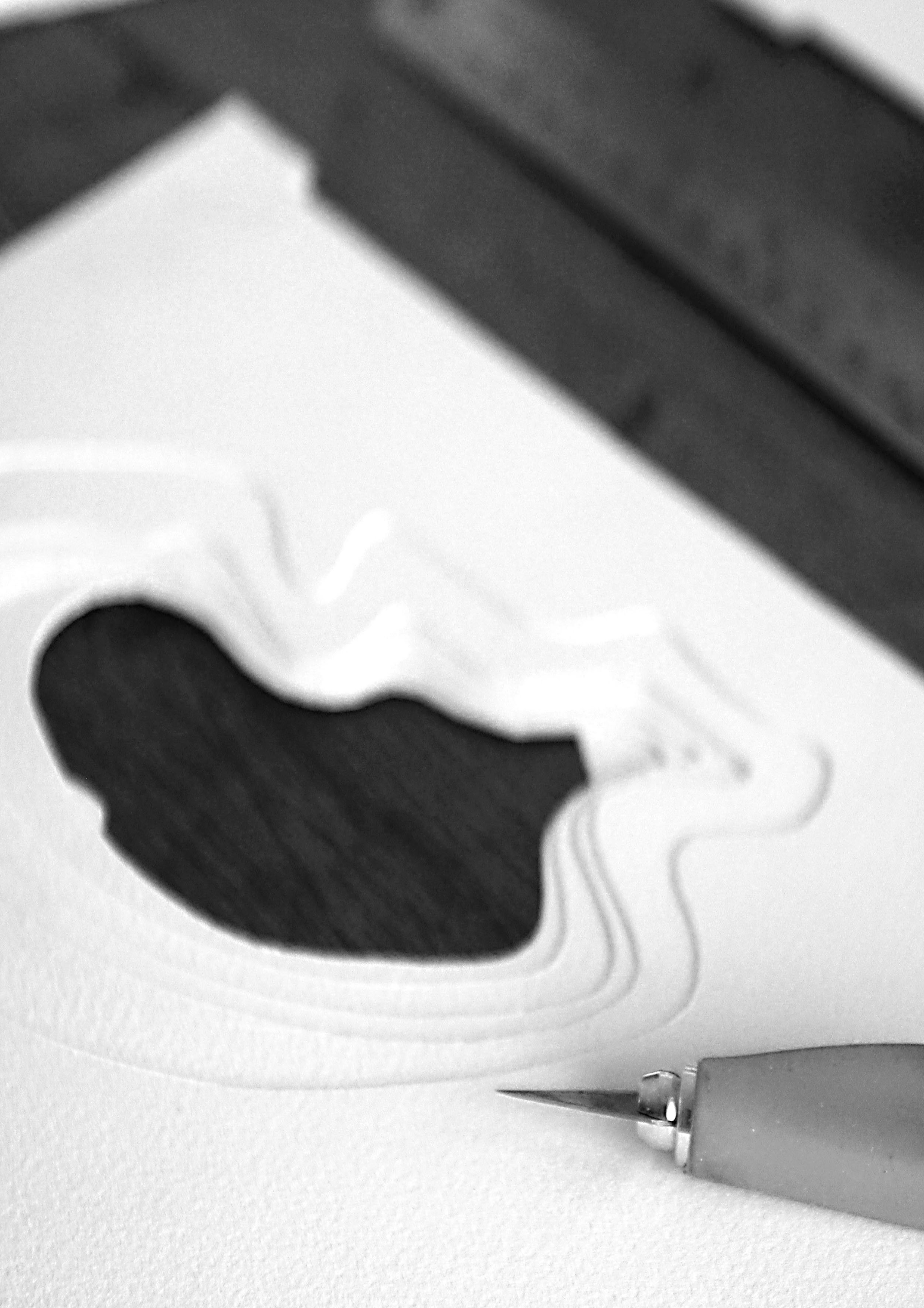
EDGAR ALLEN POE
Book Cover Art
The Tell Tale Heart
BRIEF
Create a handmade bookcover design concept with an existing title that is not the literal interpretation of it’s content. Think outside the box and highlight the physical creation aspect of the concept.
SOLUTION
As an admirer of Edgar Allen Poe and his succinct style of writing, where he is able to startle the reader in 13 pages, The Tell Tale Heart works on the heightened reality of a madman who happens to be the narrator and the murderer.
The background of this tale, probes the human psyche and paranoia of the storyteller who sees his neighbour’s eye as the ‘vulture’ evil eye that causes him distress and must be gotten rid of. He hears incessant beating sounds of a heart as it grows louder and louder, it’s the old man’s beating heart. His senses become heightened by the delusions, and he commits the heinous act.
To create the hyper reality world, the iconic shapes of the eye, ear and heart were crucial elements to portray the ‘mad’ psyche of the story teller. The use of paper layers added a tactile and immersive dimension to the tale, and having it contrast between dark and light also heightened the reality the design was about.
The disease had sharpened my senses, not destroyed, not dulled them.
Above all was the sense of hearing acute.
~The Tell Tale Heart, Edgar Allen Poe
the VISUAL JOURNEY
Hyper Reality - EAR / EYE / HEART
MADNESS / GUILT / LAYERED
The symbolism of the ear, eye and the heart was my interpretation of the hyper reality ‘madness’ for the book design. The ear signified the sounds of the beating heart, the eye was the evil ‘vulture’ eye that eats at the narrator and the heart was the guilt he had to clear, in order to feel sane again.
The layered paper was created to show how we can be slowly immersed into this hyper reality until we reach the heart.
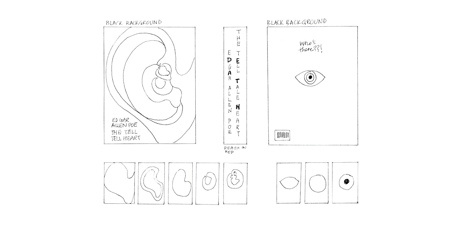
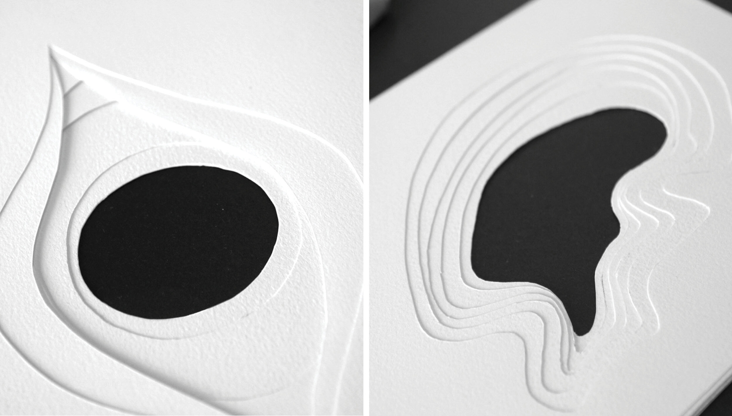
The cut outs - Paper layers
Testing different ways to cut out the layers and how it could be translated into the physical art was exciting. The outcome was to ‘keep it simple’ and refine the concept further. The details were in the layered effect of the paper and for an added effect for depth, red lights were lit under red cellophane for the heart.
Typography, after much experimentation, was kept simple with the use of the elegant font PP Cirka ( courtesy of designer Nick Losacco ).
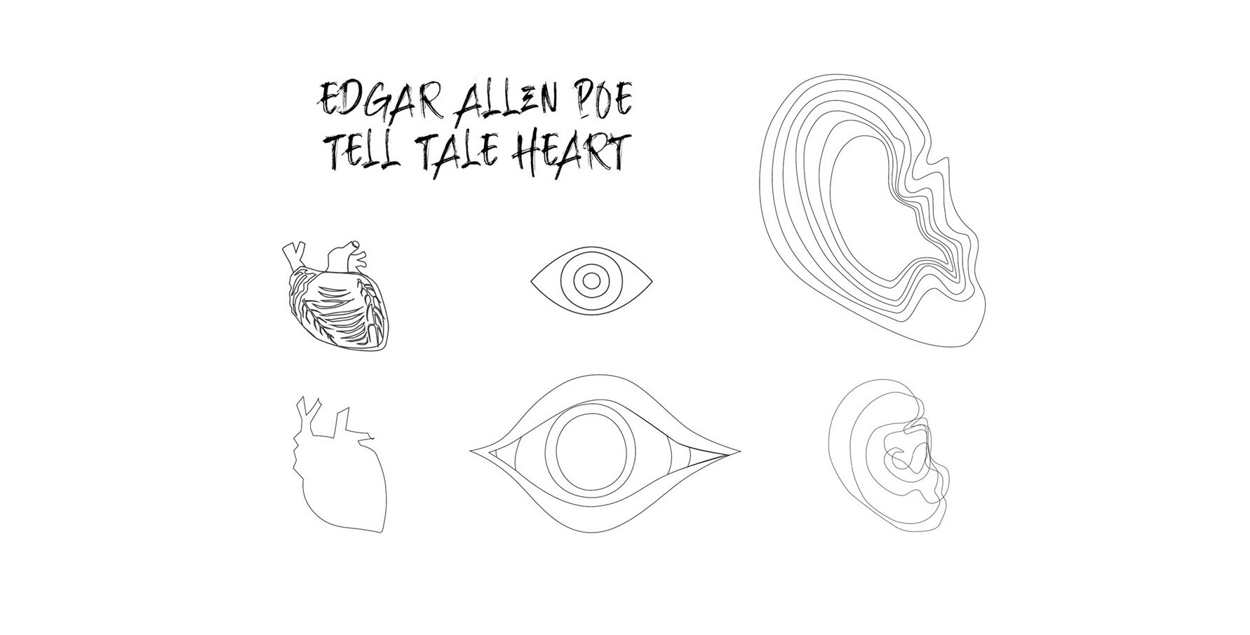
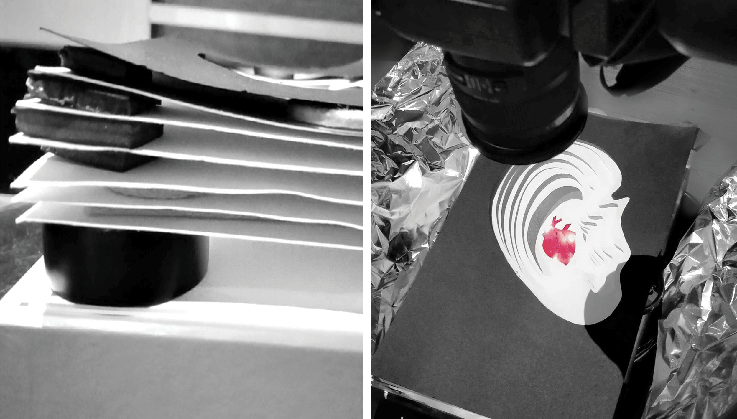
The Shoot
For the design interpretation of the hyper reality, day and night shoots were tested. The outcome was that night best represented the ear, and day for the eye. Depth was created by offsetting the layers stacked and separated evenly and the heart at the bottom layer, was given further spacing to give it more depth.
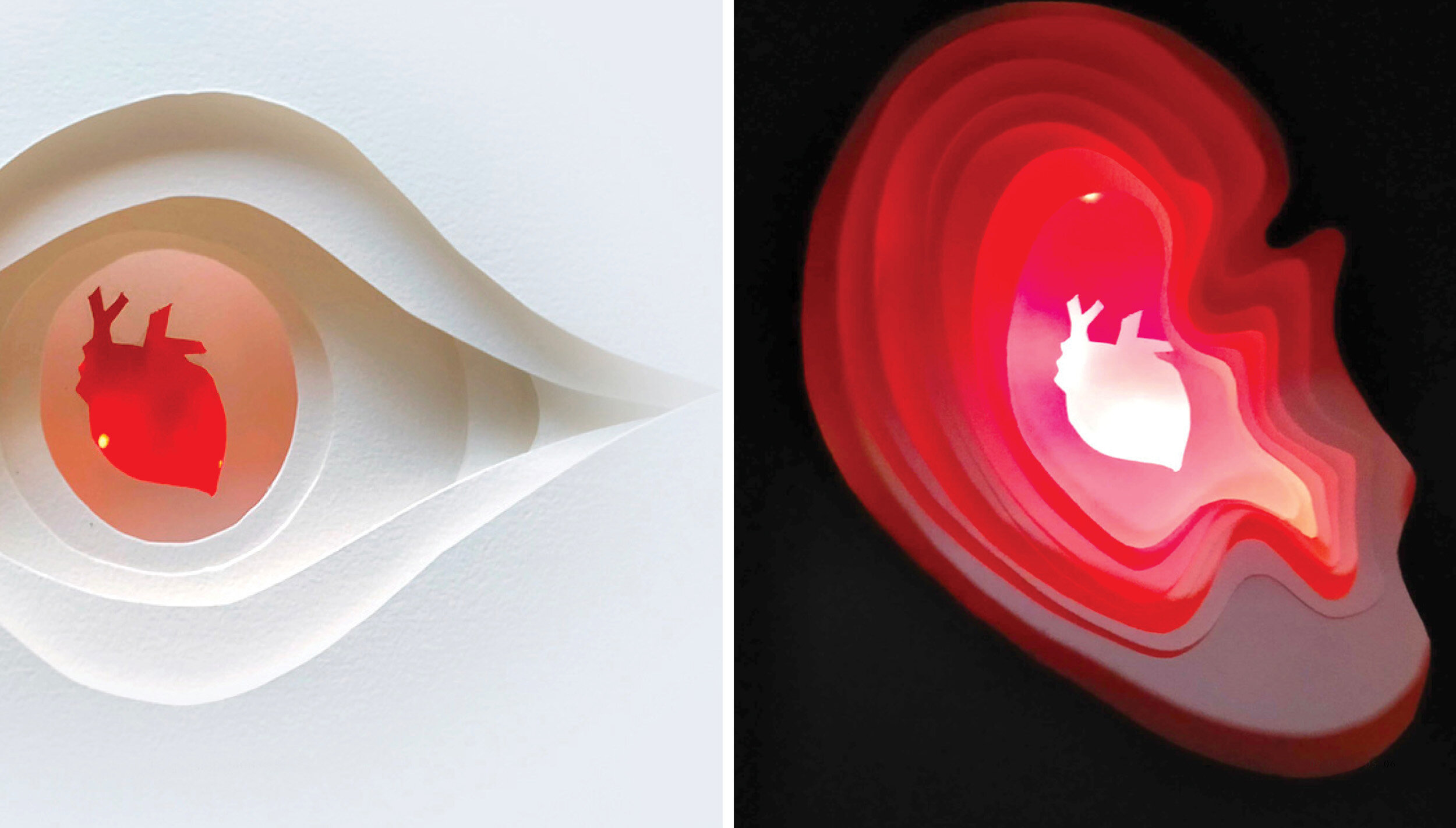
“ Shhh…. Can you hear that? “
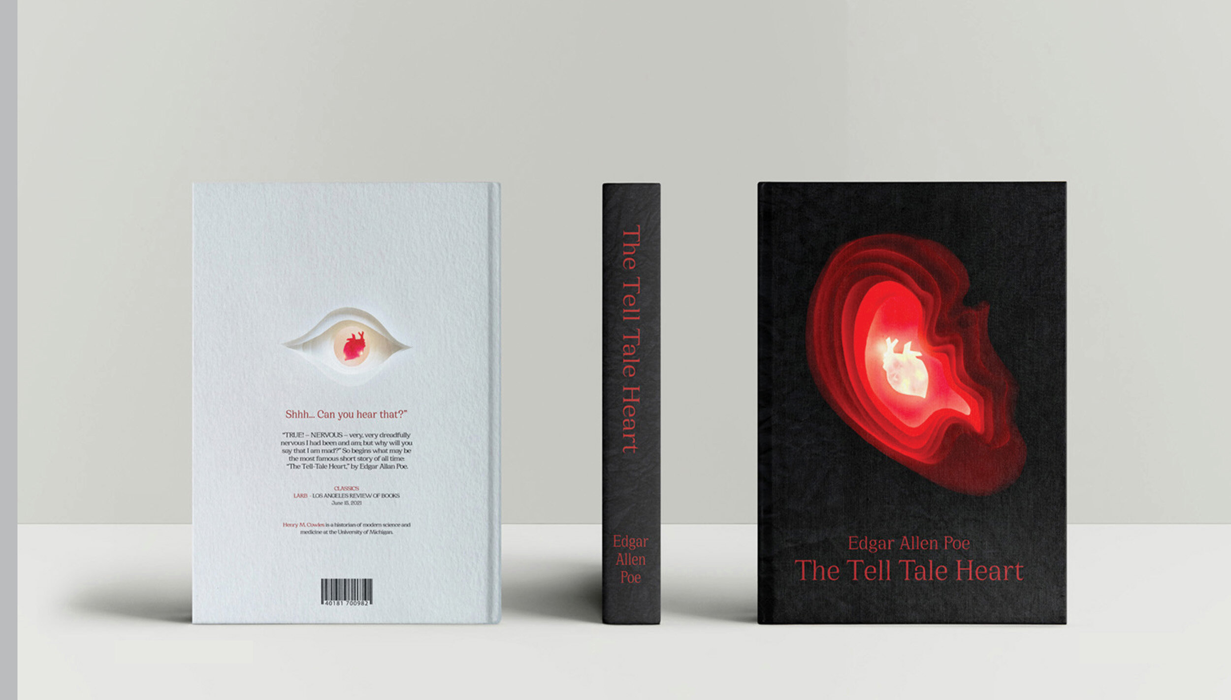

Disclaimer. This project has been created to showcase creativity, planning, execution and the completion of a concept. Thank you to all image resources provided by professionals to realise my creative spark.
